How Color Impacts the Mind
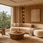
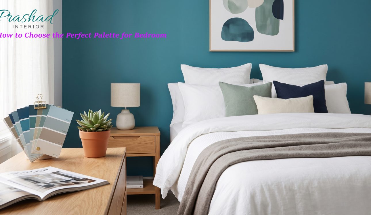
Your bedroom is more than just a place to sleep—it is a personal sanctuary. Whether you are styling a spacious house or upgrading a modern flat in Dhaka, the colors you surround yourself with dictate how you rest, recharge, and wake up.
Understanding the psychology behind room colour design can help you create an environment that actively supports your well-being. Here is how to navigate the spectrum and select a palette that looks beautiful and feels right.
How Color Impacts the Mind
Colors communicate with our brains on a subconscious level. Light travels to the retina, where it is converted into electrical impulses that pass to the hypothalamus—the part of the brain that governs our hormones and endocrine system. This means the paint on your walls can literally influence your heart rate, blood pressure, and sleep cycle.
| Color Family | Psychological Effect | Best For |
| Blues & Cyans | Lowers heart rate, promotes tranquility | Deep sleep, stress relief |
| Greens | Represents nature, restores balance | Winding down, morning freshness |
| Grays & Neutrals | Grounds the space, reduces visual clutter | Modern aesthetics, minimalist design |
| Warm Earth Tones | Creates coziness and intimacy | Large bedrooms, creating a snug feel |
Top Color Palettes for a Modern Bedroom
If you are looking to elevate your interior design, skip the stark, clinical whites and overly stimulating reds. Instead, look toward sophisticated shades that balance elegance with comfort.
1. The Deep, Restful Retreat: Dark Cyan
For a touch of modern luxury, deep cyan (Hex #0f7d7a) is a masterclass in balance. It bridges the gap between the calming properties of blue and the renewing energy of green. This rich tone absorbs excess light, signaling to your brain that it is time to wind down. It pairs beautifully with warm walnut woods, brass accents, and crisp white bedding, making it a highly requested shade for premium flat interiors.
2. The Grounding Foundation: Warm Gray
Neutrals are a staple of modern interior design, but finding the right one is crucial. A sophisticated mid-tone gray (Hex #50525a) acts as a strong anchor for the room. Unlike pure white, which can sometimes feel tense or unfinished, a warm gray grounds the space and reduces visual fatigue. It provides the perfect canvas to introduce textures through rugs, velvet curtains, and statement headboards.
3. The Natural Oasis: Sage Green
Green is the easiest color for the human eye to process. Because it is abundantly found in nature, soft greens provide a feeling of familiarity and safety. A muted sage or olive tone brings the outside in, creating a fresh, airy vibe that makes waking up easier.
3 Tips for Perfecting Your Room Colour Design
- Test the Lighting First: The way a color looks in a showroom is not how it will look in your home. Dhaka’s natural sunlight changes throughout the day, and your artificial bedroom lighting will shift the paint’s undertones. Always test a swatch on multiple walls before committing.
- Follow the 60-30-10 Rule: To keep your palette balanced, dedicate 60% of the room to your dominant color (usually the walls), 30% to a secondary color (furniture, rugs), and 10% to an accent color (throw pillows, artwork).
- Mind the Finish: Flat or matte finishes absorb light and hide wall imperfections, making them ideal for bedrooms. Glossy finishes reflect light and can feel too energetic for a space meant for resting.
Ready to Transform Your Space?
Choosing the right color is just the first step in creating your dream bedroom. At Prashad Interior, we specialize in turning everyday spaces into tailored sanctuaries that reflect your lifestyle and elevate your daily routine.
Contact our design consultants today to bring your vision to life.